Tuesday 18 October 2011

Project 2: Upcycling Utility - ZEN Light

I originally wanted to make my lamp as simple as it could get as I always thought simple looks the best. In order to get the right lampshade, I have tried various different shapes and techniques. However, as there were quite a few limitations that the project had; including reducing wastage, flat packing, I tried scoring a lot like many other students in order to achieve a variety in shapes. I think having strips lets the lamp to be more organic and active. But strips could make a model to look like a paper structure rather than a lamp; so I wanted to keep the essence of lamp but having strips.

As I have continued to experiment, I wanted to have more variety in my lampshade. So, I thought of using two different techniques in one model. For example, I could have a structure with strips and another structure with totally different technique to make the model less boring and interesting. So, as final lamp model, I have come up with a lamp with two structures; one which is colourful and has a unique shape with strips and another one with white colour that has rather simple shape and structure.

Originally, since the lamp is supposed to be environmentally friendly throughout the entire process from ‘manufacture’ to ‘flat packed’ and lastly ‘deliver’ to users, I wanted to set the concept of the lamp to be natural as well like a lotus. So, for the final lamp, at first attempt, the model was consisted of 4 wide strips but being 4 made the model look quite boxy and boring. Consequently, I have made it to be 6 wide strips which are easy to assemble with total 11 canoe clips and 11 short steel wires. The flat packed model is consisted of 4 wide strips (1000mm x 200mm) and 2 narrower strips (1000mm x 170mm) so that it makes the shape to have more variety within the actual strip structure.

Ultimately, the final lamp has both active, organic structure inside and relaxed and calming structure outside. I liked how the scored strips flow with forming unique volumes when they are hooked with wires. So I named the lampshade after Japanese Zen style as the flow of the lines reminded me of the style a lot.

The inner structure of the lamp is basically all strips so they tend to spread out the light even which may seem quite boring. However, the 3 outer white wing-like units on top of the inner structure block the light to go all over the place but lets it illuminate its white background (including letters and colours on the back). It eventually forms interesting illumination like a star as shown in the product poster. 


Monday 26 September 2011

Review: Video: What is Design?

The video ‘What is Design?’ presented by Bill Moggridge is indeed a good introductory video for those who are unsure what design is. It speaks about every single part of design from architecture to all sorts of design, demonstrating that everything is basically all designed. Moggridge shows how design impacts our life from day to day. It makes myself as an industrial design student to consider 'design' in broader perspective.

Moggridge introduces ‘Design’ as a human thought up concept which can be communicated with various techniques such as by physical means, through digital-media, software or just acting out. In that process-making and thinking, designers want to communicate to understand the people such as our individuality, relationships, surroundings, environment and livelihood. Then, Moggridge talked about Shinichi Takemura, Japanese designer and anthropologist who use his globe design to communicate his understanding, ideas and values to suit all people.

While illustrating all steps of design, Moggridge mentioned about good and bad designs. Successful design is well considered to understand not only 'people' but also personal social and environmental issues. This straightforwardly means that today’s designers are becoming more human-centered. Human-centered design includes human focus design but also includes all the surroundings aspects like mentioned earlier. I think it is why sustainable design which is about saving the environment is critical as it helps caring the environment that human live in.  

To sum up, design itself is such a broad topic and is part of every day of our life. It is vital to understand what design is as it simply makes influence at local, national and global scales like shown in the video. Also, the video clearly demonstrates the design process, so designers need to aware every step of design process in order to improve our daily life and surroundings.

Tuesday 13 September 2011

Experience Enrichment: Vigo Cheese


Vigo Cheese” is designed for those who have wished to decorate their kitchen with a functional, yet eye-pleasing kitchen tool. It is structured with colour-coated aluminium for overall body and stainless steel for the grating surface. Aluminium is used for its special properties such as corrosive resistant, reflectivity and ductility which would be useful for the product that requires good protection and conservation. It is an excellent object to exhibit on the table or in the kitchen, but at the same time it boasts a precise, state-of the-art functional performance that simply transforms into playful gestural expressiveness one of the most boring and least qualifying culinary operations.

Generally, cheese graters have not been recognised as visually pleasing among kitchen utensils due to ‘rough image of grate surface’ and ‘boring overall shape’. Apart from several particular cheese graters such as Alessi’s cheese graters, there is not much variety in shape and design of today’s cheese graters regardless of the fact that there are currently about 4 different types of cheese graters now.

Personally, until now, cheese graters are mostly designed more on functionality than its look. For example, they are comparably more designed on the basis of ergonomics and comfort. However, we must not forget the core of Don Norman’s emotional design that aesthetically pleasing products appear to be more effective to users. Even the boring grating operation can be a joy to consumers with improving pleasurability in design.

The motive of “Vigo Cheese” is to achieve both functionality and pleasurability. To illustrate, the grater has both organic and geometric lines and shapes as opposed to cheese graters in today’s market. Due to the addition of organic form to a composition dominated by geometric forms, the cheese grater looks balanced well. Ultimately, the design will give ‘energy’ and ‘natural and friendly image’ towards the users. 

In terms of functionality, “Vigo Cheese” has its special slightly curved grate surface which enable ‘rhythmic’ grating operation to consumers. It will undoubtedly make consumers to be pleasureful from its shape to practical operation. Also, the grate surface enables the cheese to come out outside so that the cheese will not get clogged in the grater. Furthermore, since the grip of the grater is placed where the centre of gravity of the cheese grater is at, it will enable users to grip much easier on the table or even in the air preventing tilting or dropping the object. So, Vigo Cheese will be not only a functional but also an eye-pleasing product in your kitchen.


Monday 22 August 2011

Review - Annie Leonard: The Story of Stuff


Nowadays, people are judged and determined by what they own, have and wear rather than themselves on the inside. Stuffs that we own have been increasingly important to us as we shop almost all the time. “The Story of Stuff” is a short film by Annie Leonard that shows the underlying truth of the entire process of consumer products from extraction to production to distribution to consumption and to disposal. The five categories has many flaws that eventually make the system linear and ultimately ruins the planet.

The major problem within the system is that government and large corporations are only looking at the money that comes out of consumer products and are always searching for the cheapest way to exploit these steps from all of the process. As Annie in the video mentioned, the government is there to protect and support its people. However, if the government only looks for a change for money, it will ultimately destroy the people or even the country due to depletion of resources.

Obviously, they are not taking into account the interactions that the manufacturing processes have with people, cultures, economies and most importantly environments. As the world keeps on being extremely fast to exploit the resources and exceedingly produce consumer goods more than what we all need, the outcomes will not be good including ourselves.

I have found that buying and owning a lot of stuff will not increase our happiness but just leave more rubbish and ruin the planet. Therefore, as stuffs are all for human in the first place, we should take into account and try making the manufacturing systems united and cycled so that there will be no linear system which will leave negative impacts to the society.

Tuesday 16 August 2011

Product sketches from 5 exhibitions

Golden Circle Chilled Juice Bottle by Outerspace Design and Heinz from Australian International Design awards 
The ergonomic shape makes the product easier to lift and improve comfort when pouring. The streamline design makes it even look better.


Genie Tea Pot by Stefan Lie from Workshopped 
This tea pot shows the flow of liquid effectively from its Genie-like sculptural form which is very unique and fun to use.


The Red Chair (do not know name) from Au.thentic
The red chair shows its vivid colour with the ergonomic shape which is quite interesting to sit on or even have a look. I also like that it is made of one piece which is interesting and looks very original.


Let there be light by Stephanie Howe from Sparkies, Foodies, Fashionistas Exhibition
It is interesting how paper is used in lighting design and emphasizes the specialties of the material which I think are thinness and sharpness within the design. Overall, I think the geometric shape of the lighting is very original and intriguing.


Butterfly stool by Sori Yanagi from Japanese Design Exhibition 
The Butterfly stool shows European shapes with the technique developed by Charles and Ray Eames of shaping plywood. The gently curved silhouette is reminiscent of the wings of a butterfly.

Friday 12 August 2011

My Design Career

Ever since I was a boy, I have always been interested in art and drawing. I haven’t particularly been told that I am good, but I have enjoyed drawing and making with whatever I had. In high school, I did enjoy subjects like English and science, but I especially enjoyed working on my artworks for art subject. On other side of my mind, I have had passion to study design because I have seen many friends studying industrial design, interior design, fine art or even architecture. That, I think, is the motivation of choosing Industrial design as my major

I was quite influenced by my friends to apply for industrial design as I have heard and thought that there can be a variety of opportunities and directions in future after studying industrial design as major. Also, at the time when I had to apply for universities, I finalized myself that I am more into design rather than art because I wanted to study design and leave art as one of my hobbies. Frankly, it is quite difficult to particularly separate design and art but that was what I thought at that time.
Among other universities, I chose UNSW as the university is well-renowned for its exceptional quality of education and campus environment. More importantly, industrial design program at UNSW is comprised of a diverse range of design activities such as model making and computing design. That is another vital reason why I chose UNSW as the high reputation of UNSW would support me well to study the significant features of Industrial design.

For my future in design, I would like to travel and broaden my sight in terms of design and develop myself as design will be my career. As I have learnt that design is not only about producing products, but also expressing emotions and personal ideas. Therefore, as I am aware that I am predominantly lack of that now, I want to develop myself by travelling before getting a job or anything.

Tuesday 2 August 2011

Design Excellence: Breville One-Touch Tea Maker


By analysing this product, I could understand more deeply on how visual elements of design could affect or appeal users from purchasing it. As far as the visual elements go, the Breville tea maker is predominantly functional and visually impressive compared with other tea makers out on the current market. This award-winning product has all the dominant features that the tea maker as a design product in the kitchen (as Breville intended) which interested me throughout the process of product form anaylsis.

Monday 1 August 2011

Review: "David Kelley: Human centred design"

The video gives you an insight on how design is becoming a part of our lives by including personalities and behaviours to be more human-centred. It demonstrates how designers address the needs of humans in most designs and the processes they go through to figure out the problem. For example, ApproTEC project in Kenya illustrates how we as designers can make the world function through an economical advantage in helping others.

Moreover, David Kelley showed the Prada store of New York City which was greatly renovated to improve the service and therefore customers’ satisfaction. For example, one of the new systems they came out was the scanning the products that a customer is interested on. By simply scanning the product, it will appear on any touch screen in the store and the customer can choose the size and color. Then it can be taken to the dressing room which also has a scanner so the retailer knows exactly what clothing is been taken.

The renovation improved every single service that customer can benefit from. For instance, the use of liquid crystal on the walls of the dressing room is the application of the renovated technology. While the customer is changing, the wall will go black and blocked, However, once the customer is done with dressing they simply step on the button and the wall will go transparent again for their company. There is also a magic mirror inside the dressing room which has the ability to hold the image to show the look to the customer. From this, customers can check how it looks like on different angle.

Another dominant idea was to create a digital installation of a wall in London science museum. It conveys some of the feedbacks from people who had visited to the museum  displayed on the wall so everyone could examine. Like London station line, they have produced a tube line as if the trains are the way that people think and when the little tubes arrive at the station it expands what it is saying so people can read. On the IMAX Theater there are big open spaces that tables displayed and have interactive games. The topics included male fertility, choosing the sex of your baby and what will it be on driver less car.

Excerpts from “The Big Idea” by CBS Sunday Morning, Scott Adams asked for the creation of Gilbert’s ultimate cubicle. Basically, the team tried to change the atmosphere of cubicle by changing the interior. One of the groups built the walls as screens for the computer and for photos. The second built the walls as alive and they actually give the Gilbert a group hug, and behind this humorous idea they were giving the cubical more human. The final cubical chosen is opened and connected to the environment so it is mentally healthy, and the flower as a decoration stands up when human is inside the cubical to make human feel like to be responded. There were also some touches such as putting a fish tank on the wall and a punch bag with the boss’s face on it.


Also, they designed the “recycling of the water” had the main concept of showing the process of recycling water. It is another great example of human centered design as the recycling water is an obvious allusion to ecological sustainability which means the sustainability of mankind. Also, the spyfish was futuristic and the whole new idea for the people who are interested on under the sea but could not examine because of their lack of abilities. It is designed from  H2Eye that targeted the people who enjoys being on the sea but does not scuba dive. Through this machine, people can explore under the water without getting wet.

I have discovered it is important for industrial designers to watch the video as it allows them to see what capabilities we have and how we as designers are affecting the world in a positive way. We are able to see other people’s designs and see their reasons and philosophies in doing so. 

Tuesday 26 July 2011

Don Norman on 3 ways good design makes you happy

Video: http://www.ted.com/talks/don_norman_on_design_and_emotion.html


Firstly, the vital point of the video is that “pleasant things work better.” The video demonstrates that there is also a strong emotional component to how products are designed and put to use. In the video, Norman emphasizes how emotions affect purchase decisions based on three aspects of design: the visceral (appearance), behavioral (performance) and reflective (memories and experiences) level of processing.

The visceral level is the instinctive part of the brain which reacts to threat and makes judgments based on biological responses. For instance, even though we do not need visually attractive objects, we are subconsciously having them.  It is because visceral design equates to appearance. Designing for the visceral level makes people wanting to have a attractive sports car that may not be functional or Phillip Starck Juicer as shown in the video.

At the next level of processing is the behavioural level which involves the pleasure of using something – the usability, functionality, efficiency, or ergonomic comfort of a design. And at the highest level of processing in our brain operates the reflective level which involves the way a design affects our self-image (Mercedes for gentlemen), the associated memories (a photo album or a personal gift from a friend), or the level of satisfaction that is associated with an object.

Emotional Design asks why we love or hate everyday things. Also, given the three levels of processing within our brain, it also asks us how do we design objects which meet our design objectives. It is because all things aren’t equal in the world of objects. Some ugly things are loved dearly, while other beautiful things might not be. I think beauty, as they say, is in the eyes of the beholder.

After watching the video of 13 minutes, I finalized my idea that designers need to uncover the fact that emotional side of design is simply more critical to a product’s success than its practical elements. I certainly think that Norman opened my eyes to some extent about the different ways that people engage with a design. There’s the aesthetic beauty (or ugliness), the object’s functionality, and its perceived levels of satisfaction. It proves that design is a multi-dimensional approach to solving problems.

Wednesday 1 June 2011

One of my favourite design websites (blogs)

http://www.abitare.it/

This blog or should i say website is the one that I frequently go on to have a look on some innovative design works from all over the place.

It is italian so quite hard to understand the writings on the page but you could find and check  numerous design works from various websites which i really like.

So Check Out!

Sunday 29 May 2011

Family Tree Assignment!

I have chosen electronic calculator as my main product and I have divided the development of it into 5 sections and illutrated as a graphic family tree map.

Tuesday 3 May 2011

Karim Rashid Watch


The watch has so great vivid colours and also unisex that basically anyone can wear!
I really like the organic shape of the wristwatch and the smooth feel of it.
Definitely let us know that they are designed by Karim Rashid.

For more info, go to http://www.panik-design.com/acatalog/Alessi___Karim_Rashid____Kaj__Pink_Watch.html

There are heaps more!

Friday 22 April 2011

TED talk


I recently watched a TED talk about the invention literally saved and unlocked a mobility impaired artist.
The artist was TEMPT who was one of the foremost graphitti artists in the 80s.
One day, he got a disease called ALS which completely paralyzed him from toe to head.
He now has only use of his eyes to communicate with people.

Mick Ebbling who has taken the lead and invented a device which makes a person to draw with his eyes!

It has made TEMPT to draw again and be an artist again.
I was so touched from what Mick and his team have done which will absolutely give more hope and passion to art to people who suffer from disease or even got impaired like TEMPT.

Tuesday 19 April 2011

Powerhouse Museum

It's been a while since I posted on this blog.
Had troubles with the Internet and assignments should I give you some excuses. :)


Anyway, last week I had a chance to visit to the Powerhouse Museum. Fortunately, when I visited there there was
the 'Australian International Design Awards' going on.

Also, there was a Gonz's work which was really surprising because I couldn't even think of seeing his work in the museum! (for photos check out Clement's blog!)


Anyway, it was really fun visiting there as there were many other activities happening in the museum such as ABBA exhibition and the design awards just to name a few.

I'm not sure whether the design awards is still on but I guarantee it's the best chance for us, product design students see the real design awards and check out Gonz's work which was great!

Monday 21 March 2011

My poster mash-up

My poster mash-up. What do you think?
I will post up short explanation and background meaning behind this soon. :)

Thursday 17 March 2011

Colour Wheel Project!

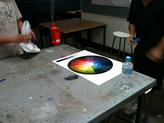
We messed up our first colour wheel in the tutorial class last time. So, we had to meet up after a few days and draw up another sheet of template and finish the project.
It took us about 8 hours (I heard that most groups took long time like us! great job everyone :D).
Anyway here are some of our photos while we took during the time.


We end up finishing the colour wheel with decent quality. I think we could have painted lines more neatly but it was fine to compare and see the colours.